
Student Analytics Introduction
The SchoolWise Student Analytics System helps you to make sense of your school’s data by adding powerful data analysis and visualization tools to help track and manage student performance.
- Use custom data indicators to help identify struggling or at-risk students while there is still time to get them back on track. Data Indicators can include Letter Gradebook Scores, Attendance Exceptions, Discipline Incidents, Program Enrollment, etc.
- There are two main components: data aggregation (which runs automatically each night) and data display which allows school staff to view and analyze the data through interactive dashboards.
- The dashboards include interactive charts (Pods) with drill-down capability to see the detailed data.
- Use the pre-defined dashboards, or build your own custom ones.
- Simple implementation – no data imports or exports needed. We use your existing SchoolWise SIS data.
Student Analytics is accessed from the SchoolWise web school office menu.

Web User Privileges need granted to staff to provide access to student analytics data. Click here for instructions.
Video Tutorials are available for training. You can access these videos from the link in the top right corner of the Analytics Dashboards.

Analytics Data
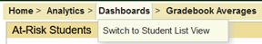
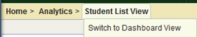
Viewing the Data: There are 2 views available, the Dashboard view or the Student List view.
You can switch from the Dashboard view to the Student List View by clicking on Dashboards and selecting it.
You can switch from the Student List View to the Dashboard view by clicking on Student List View and selecting it.
Dashboards
The dashboard system allows the school staff to view the Indicator data in interactive charts. A “Dashboard” is a collection of charts (called “Pods”) which provides a visual summary of aggregated data over a specific time period (4 weeks, 8 weeks, 12 weeks, full year). Typically, each Pod will display the data for a single Indicator. Filters can be applied to each dashboard Pod to filter the results by School, Grade Level, or by Student Performance Group.
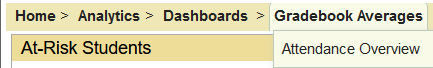
Gradebook Averages is the default dashboard shown. Attendance Overview is an alternate dashboard you can display by clicking Gradebook Averages link and selecting it. Additional custom dashboards can be created to organize specific Pods.

Once Student Analytics has been enabled, the default dashboards will be populated with your student data. A school can use the defaults, modify them, or delete them all and start from scratch.
The default dashboards are currently available to everyone that has access to analytics.
Custom dashboards are only visible to the user who creates them, until they are shared. At this time, when you share a custom dashboard (with any user role) it becomes available to everyone that has access to analytics. In a future update we will add the ability to define specific user role assignments that you can share with (ex. teachers, counselors, administrators).
Configuring Indicators: Thresholds, Risk Points and Pods
Indicators
Schools define the data items that they want to track by creating “Indicators”. Each Indicator defines a single data item that the system should aggregate for its students. Each indicator describes the table/view and field name that it monitors. An Indicator also includes a Performance Level Map that describes how the values for the indicator should be categorized. For example, an Indicator for Gradebook Math Average might define performance bands for: A (>=90), B (>=80), C (>=70), D (>=60) and F (<60).
A school might define a couple dozen or so Indicators (and their performance bands) that they want to monitor for their students. Each district starts out with a default set of Indicators that cover typical monitoring needs such as Attendance, Gradebook Scores, Discipline, Program Enrollment, Standardized Testing, and Nurse/Counselor Visits.
Create Indicators
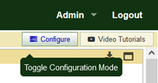
Click the Configure button to enable configuration mode.
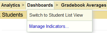
Then select Manage Indicators from the Dashboards menu.
Select the desired indicator category (bold text) on the left and then click Add a New…
Define the Performance Band Threshold Map. Different Threshold Maps can be defined for specific schools or grades using filters.
Risk Points
Each performance band of an Indicator may be assigned a number of risk points to help identify at-risk students. For example, in our prior example of a gradebook Math Average indicator, you might assign 5 Risk Points to band 4 (D), and 10 Risk Points to band 5 (F). Each night when all the Indicators are updated, the total Risk points for each student will be summed up from all indicators. The higher a student’s Risk Point total, the more attention they likely will need to get back on track.
Performance Groups
Each Performance Band of an Indicator may also be assigned to a student Performance Group. For example, in our earlier example of a Math Average Indicator, we could define a Performance Group named “Needs Math Help” for bands 4 and 5 (students with a D or F in the subject). For an Attendance Indicator, students with >10% absent could be assigned to a Performance Group named “Chronic Absent”.
Student Performance Group filters are an especially useful tool for cross-applying results from multiple Indicators. For example, say you are looking at the graph showing the Indicator for gradebook averages for a school. You can then select a Performance Group (defined by the Attendance Indicator) filter to show the Gradebook Averages for students who are Chronically Absent – or combine Performance Groups to view, for example, the grade distributions for Homeless Students who are Chronically Late to school.
Performance groups can be anything you like. Just create/edit indicators to create the groups you want to filter on. Then once the performance groups are defined the way you want, you can use them to filter results in any display pod.